About Bitmap Fonts
How bitmaps occupied a weird place in typography from phototypesetting to WYSIWYG Graphic Design.
Bitmap fonts played a special role in the history of typography: for a short period of time, typography occupied a unique place in computer screens, a place not shared with paper, the natural place of typography for many centuries. This role would later converge with print, as screens got enough resolution to faithfully represent the same glyph shapes that printers would later print. We'll explore how and why those fonts came to existence, and look at some of the most prominent examples.
Brief history of printing in the 20th century
Let's start with printing at the beginning of the 20th century. A period of industrialization, where printing went from the typesetting craft of yore to the modern offset industrial printing.
At the beginning of the century, typesetting transitioned from manual typesetting, the craft of composing words letter by letter by arranging metal moveable types that had been the norm for centuries, to hot metal, by means of newly developed mechanical machines (Linotype, Monotype, etc). With hot metal, blocks of type (called slugs) were created casting typography with hot metal into moulds. These slugs would then be set in blocks to form a page, speeding up the whole typesetting process.
But advances in technology produced a new way to make letters for printing purposes. The creation of film allowed the transition from letterpress printing, that worked by punching raised letter shapes with ink on a paper, to offset printing, where a full page was composed and photographed, and then projected on a light sensitive plate with a special coating, the result of which was an image of the (reversed) composed page were ink will stick to the unexposed parts, and then transferred to the paper continuously by a roll.

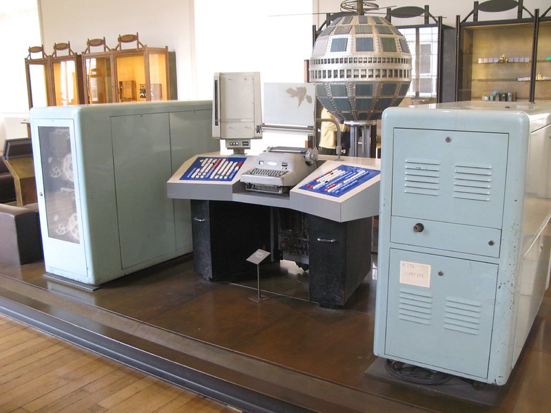
At the same time film was revolutionizing the printing side (output), from the design side it was also changing the way typography was composed. Composing pages with type was changing from hot plate typesetting to phototypesetting. Mechanical machines were created (Lumitype, Linofilm, Monophoto, etc.) that had typography film disks that could be used to project the characters onto a film paper one by one, and in that way you could create paragraphs of text in the font you wanted on paper, that could be photographed later to be used in offset printing.
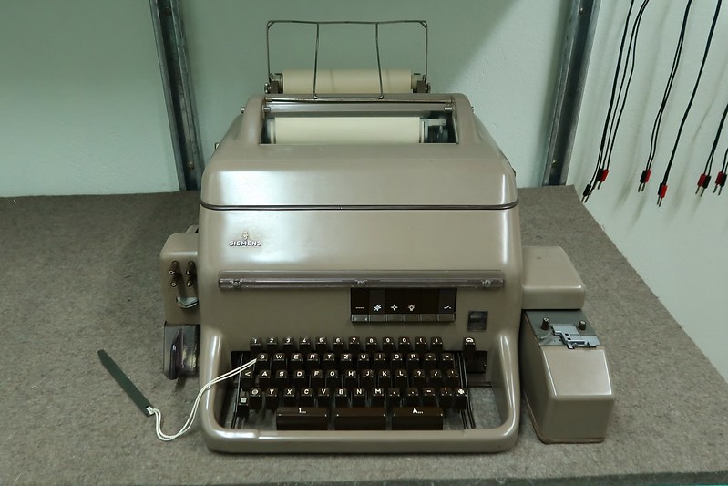
This was made even more convenient and faster when computers were added to the mix. German inventor and engineer Rudolf Hell created the Digiset 50T1 machine in 1965, starting the digitalization of typesetting. The Digiset was a digital phototypesetting machine controlled by a computer. The glyphs on this machine were created internally on a CRT, and the definitions of these glyphs were bitmaps stored digitally in the computer memory (instead of being pre set on film discs). These glyphs would then be projected to a film paper, in a similar way previous analog phototypesetting machines did. But there was no screen present to input the commands to create the letters, it was done with paper tape, magnetic tape or a teletypewriter in a specially designed program.
It wasn't until 1984, with the creation of the Apple Macintosh and the WYSIWYG (What You See Is What You Get) paradigm that you could visualize typography on a screen in the (approximate) way it would look on the printed page. So for a few decades, the fonts on the screen and the fonts printed on paper diverged, until they converged again. Let's explored what happened with screens during that time.
Computers and screens
Let jump to the 1950s with digital computers, at the time were microchips started appearing and displacing vacuum tubes. At this time, CRTs, that were used for TVs since the 30s, were starting to become really popular. But it'll take a while for them to be fully incorporated into computing as output devices.

The first interactive way to interface with a computer was the teletype. Teleprinters (or teletypewriters, teletype for short) had been used for telegraphy since the end of the 19th century, and then were adapted as a way for a person to input commands to a computer. The output for this interaction was paper: you wrote the commands in, that were printed on paper as you wrote them, and you saw the results out from the computer printed on the same paper after the program finished its tasks. These devices were called “terminals”, and remained the main way to input programs and interact with computers even when CRTs were readily available for other devices like TVs and oscilloscopes.
In fact, one of the first graphical computer output devices were oscilloscopes repurposed to visualize the output of computer data, like the one used for the earliest videogame known, called "Tennis for Two", programmed by William Higinbotham on a Donner Model 30 analog computer. Radar CRTs were also used, like the Type 30 used on the PDP-1 (most of these CRTs were round). And the first fonts seen on these screens were constructed in the same analog way oscilloscopes worked, in what we later called vector fonts. The CRT beam was instructed to move in a controlled way so as to create lines that formed letters on the screen. These first rudimentary fonts were geometrical and angular, as creating curves required a processing power that those first computers lacked.
First bitmap fonts

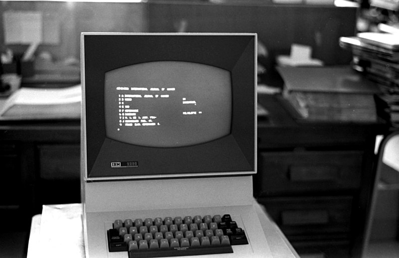
Eventually, CRTs started to be used with computers, first to display information (as Video Display Units, or VDUs), but later to replace the paper input/output of terminals: the glass terminals were born.
So, to display text in a similar fashion to paper terminals, is was decided that the most efficient way was to create low resolution digital fonts that would be stored in the computer, and would be shown in the screen as the person typed, and thus, the bitmap font was created. One of the first “glass terminal” to use a bitmap font was the IBM 2260. It had three modes: 40x6 characters (240 total), 40x12 characters (480) or 80x12 characters (960). Not much is known about the bitmaps used in this terminal, except for a few pictures in the operator manual1.
Notable bitmap fonts
After these first “glass terminals” (that was later called “computer terminals”), many others followed. The need to create bitmap fonts on the screen was acknowledge by the industry, and so, microchips with font definitions started to be offered, as that would be cheaper than developing them yourself. One of the most significant ones was the Signetics 2513, used in the TV Typewriter, Apple I (and early Apple II) and early Atari arcade games, to name a few notable uses.
With the advent of Home computers, many new bitmaps fonts were created, and some of them are easily recognizable, such as: PETSCII (PET, VIC 20, C64), ZX Spectrum, BBC Micro, IBM PC BIOS font (Code page 437), Atari arcade font2, ATASCII (Atari 400/800), Amstrad CPC 464 font, etc.

With the release of the Apple Macintosh in 1984, computer screens had gained enough resolution to show fonts on the screen with an approximate shape similar to the one that would be printed later. The first fonts were a collection of bitmap fonts depicting the same font at different sizes.
This would change by the 1990s, when TrueType and Postscript Type 1 and Type 3 font technologies were created. These technologies had vector definitions of fonts for the printer, while visual hinting created the bitmap fonts for the screen on the fly. As screens improved and gained more and more resolution and computers got more powerful, fonts could be rendered on screen from their vector definitions with high fidelity, and the need for bitmap fonts for disappeared. Paper and screen were finally united in typography representation.
Are bitmap fonts dead?

One may be inclined to think that, with the advent of high resolution screens, bitmap fonts have no longer a place in the modern world. But the truth is that there is still a significant amount of low resolution displays in modern devices that make use of bitmap fonts. Small LCD and OLED displays are still used for some specific cases, controlled by microprocessors that have not enough power to drive high resolution RGB displays.
For some transit applications, like bus and train signs, flip-disc (or flip-dot) display are still in use, since these displays have a low frequency update rate, and are energy efficient.
And also in the retro computer scene, new microprocessors are allowing for the creation of new modern-retro computers, that may lend to the use of bitmap fonts (an example of which can be seen in BASIC Engine and the font I created for it: BESCII).
So, being for technical or nostalgic reasons, bitmap fonts are still present in our lives. Their quirks are really interesting, and worthy of being looked at. I hope you now have a better understanding of their inception, and the role they played in technology history.
Footnotes
- IBM 2260 Operator manual, page 2. ↩
- The Atari arcade font (also called "Sprint 2 font", "Namco font" or simply "Arcade font") is one of the most recognizable bitmap fonts, used in many arcade machines (with small variations). It was first used in 1976's Atari arcade game "Quiz Show". ↩